Graphite
2024–2026
I joined Graphite when the company was around 25 people, before its Series B. During my time there, I spent my first year redesigning Graphite's pull request page and code review experience. This was Graphite's most important product surface, and the place where developers spent most of their time reviewing, understanding, and shipping code.
I later helped bring Graphite's core review experience to Cursor customers after the acquisition.
Below are highlights from my time at Graphite.
Redesigning the code review experience
Problem
Graphite's PR page was the most important part of the product, but also one of the most complex. Over time, the interface had accumulated visual clutter, dense information, and interaction patterns that made reviewing code harder than it needed to be.
The challenge was to improve the experience without making it feel unfamiliar. Developers already had a strong mental model from GitHub, so the product needed to stay recognizable while becoming more modern.
Process
This was heavy UX work. I spent a lot of time prototyping in low fidelity, speaking with customers, testing solutions, and building relationships with engineers from teams like Notion, Shopify, Netflix, Figma, Robinhood, and more.
The work involved exploring new layouts, reducing visual noise, improving how comments behaved inside the diff, and rethinking how stacked PRs should appear on the page.
Solution
The PR page was redesigned around speed and focus.
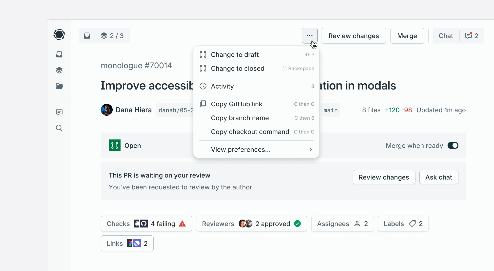
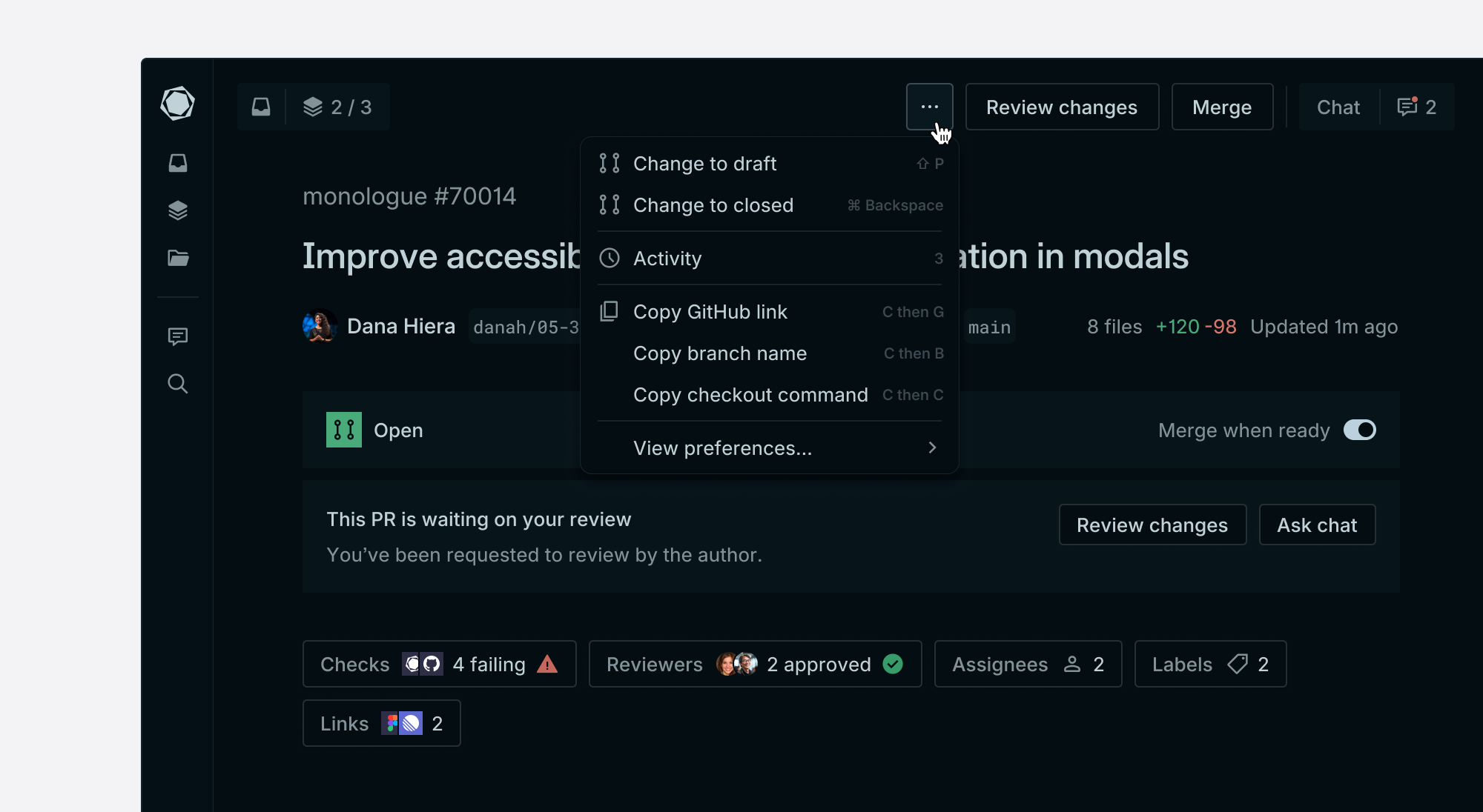
The new experience reduced visual clutter, brought the code back into the center of the page, and made comments easier to follow without interrupting the review flow. Floating comments helped reviewers stay immersed in the diff, while a rich text editor made writing and formatting comments more approachable.
Challenges
This project had a lot of organizational complexity. The PR page touched nearly every part of the product, and many people had strong opinions about how it should work.
Some of the larger design improvements were ultimately reduced in scope as priorities shifted, but the work still helped create a clearer direction for Graphite's core review experience.
A new visual style for Graphite's file diffs
Problem
Graphite's file diffs felt outdated. The experience worked, but the visual design didn't reflect the level of quality we wanted from one of the most-used surfaces in the product.
Process
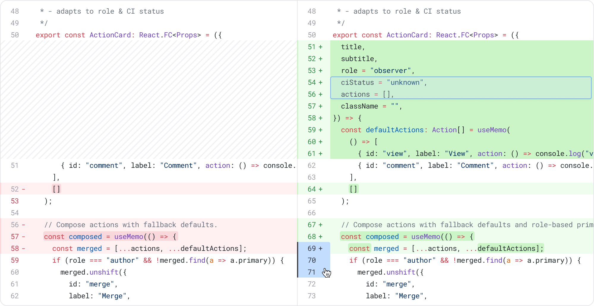
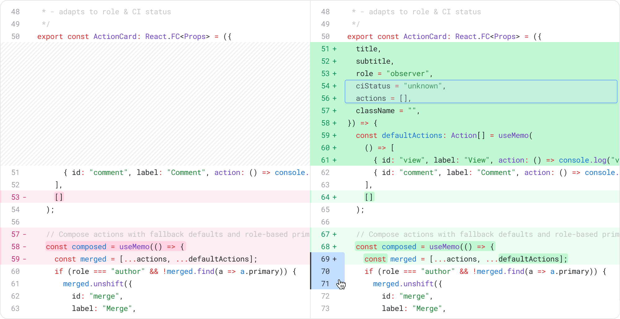
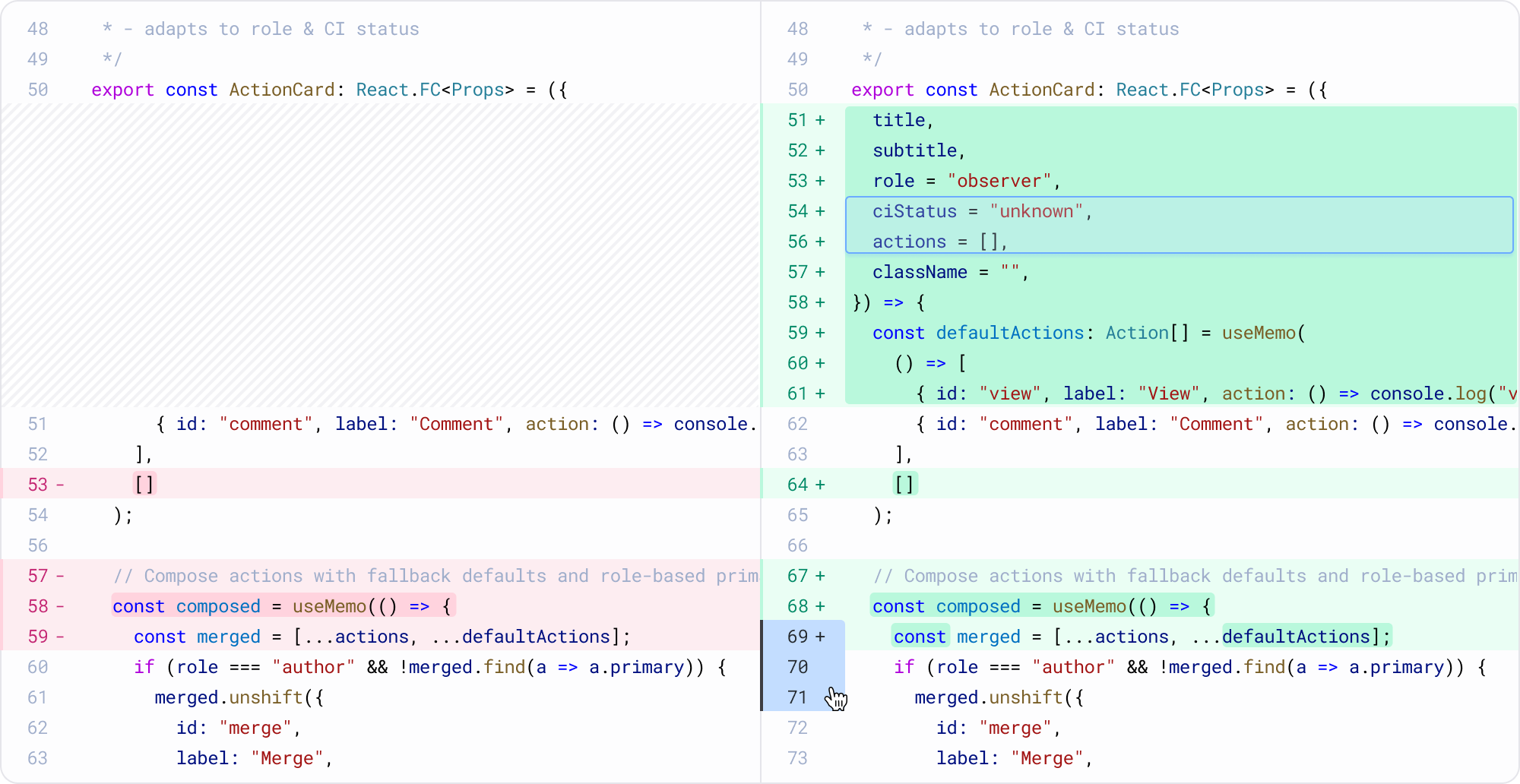
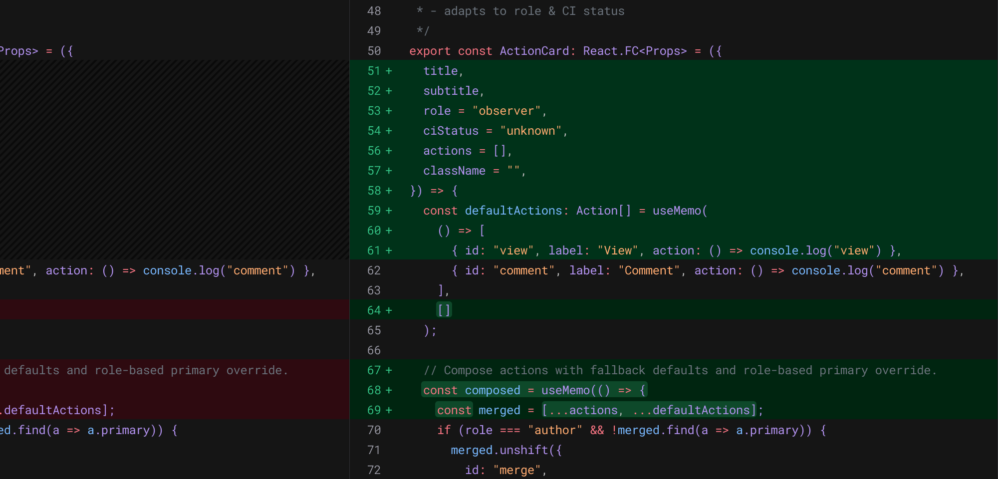
This was a chance to flex more visual design muscles inside a very functional product surface. I explored many iterations of the diff experience, looking at spacing, typography, syntax treatment, line numbers, comment states, selected states, and the overall density of the page.
Solution
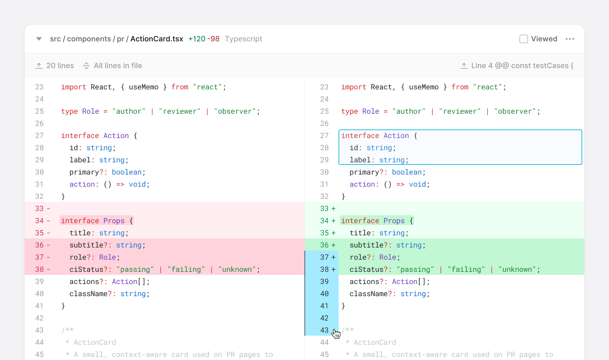
I created a more modern visual style for Graphite's file diffs.
The updated direction made the code feel cleaner, easier to scan, and more aligned with the broader product direction. It gave the review experience a stronger sense of craft, while still keeping the diff itself as the focus.
Refreshing the design system
Problem
Graphite's design system was struggling with many of the same problems design systems face as a company grows.
It had become harder to scale, visual consistency was slipping, and the product's style no longer felt as sharp or intentional as it needed to be. There was also limited documentation, which meant new designers and engineers often developed different mental models for how components should be used.
Process
I led a workshop with the product design and brand design team to build alignment around the future direction of Graphite's in-app visual style.
We mapped where the product currently sat, and where we wanted it to move, across scales like playful vs. serious and familiar vs. novel. This helped make subjective visual decisions easier to discuss and critique.
From there, I created four different visual directions for the design system and PR page. Each direction explored a different aesthetic and aimed to evoke a different feeling for customers. We reviewed the directions as a team, captured feedback, and used that alignment to inform the refreshed system.
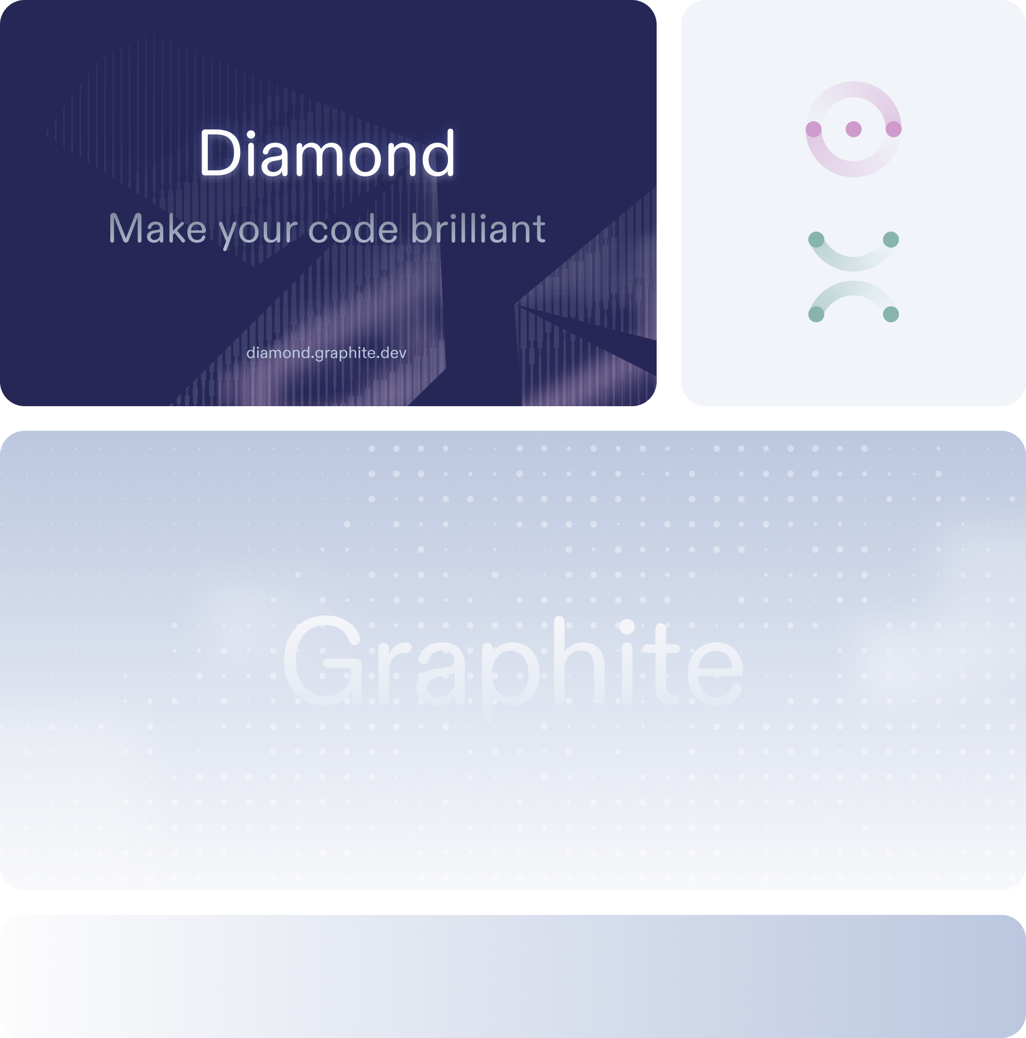
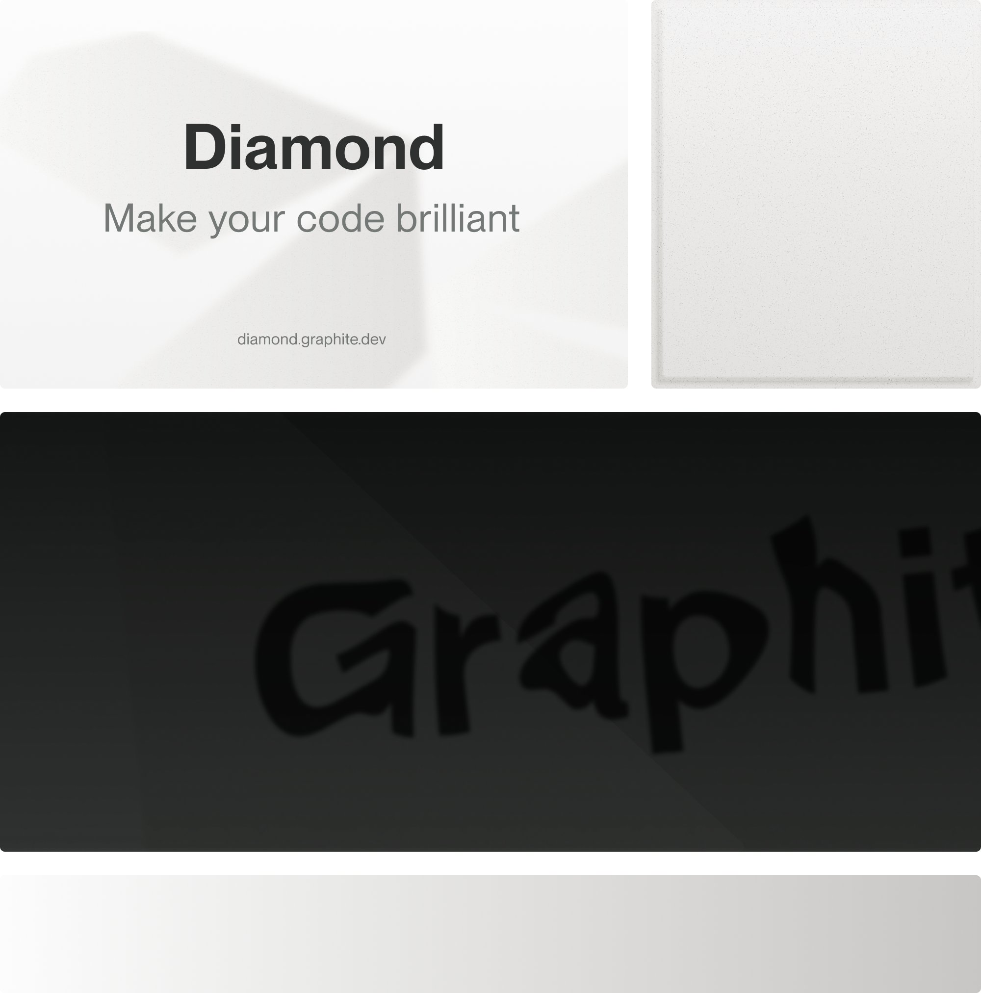
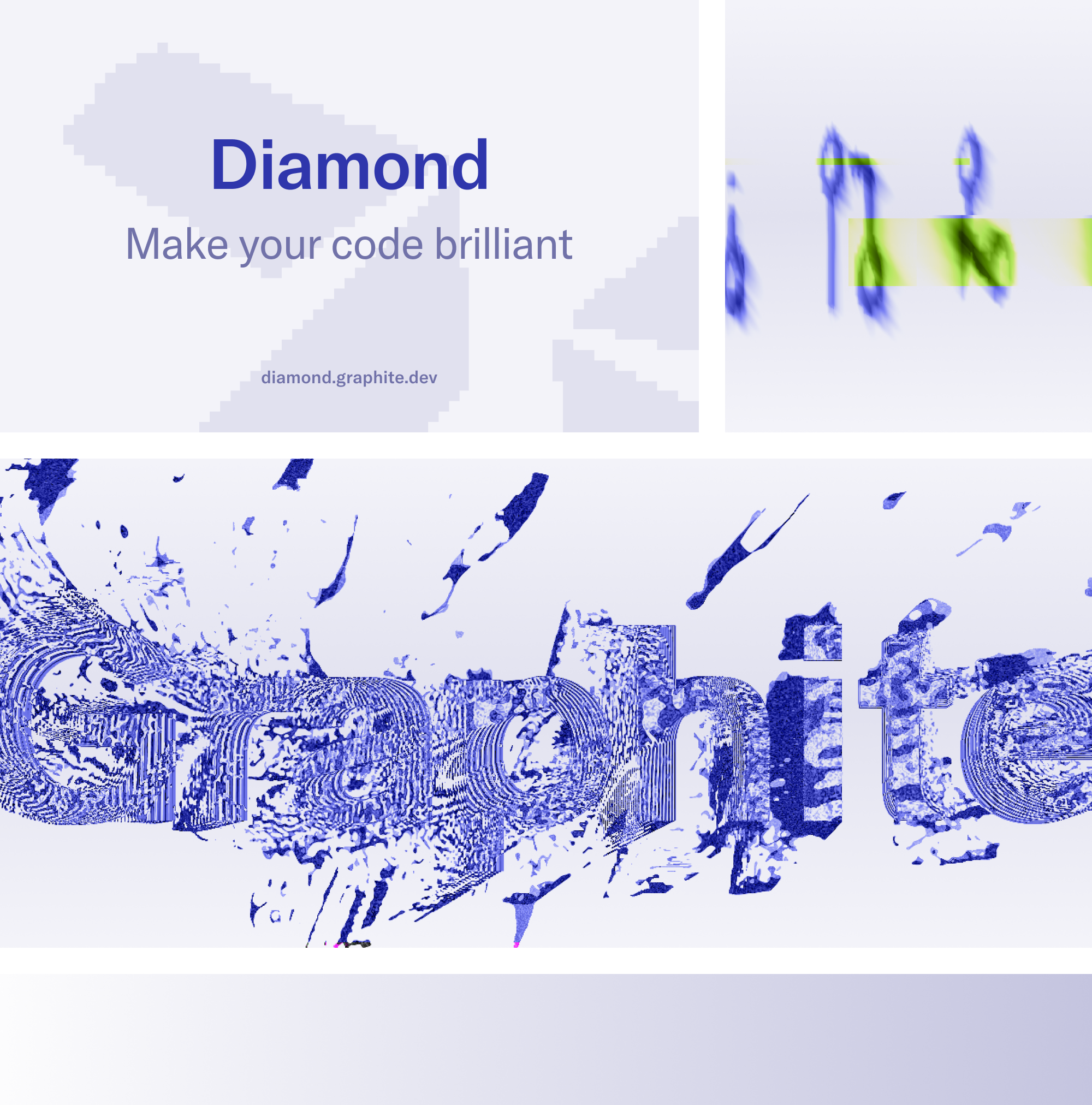
Solution
The refreshed design system focused on consistency, scalability, and a more modern visual style.
The goal was not just to make components look better. It was to create a system that designers and engineers could understand, extend, and use more confidently. It also considered how design systems might need to evolve in an AI-native product world, where more interface decisions may be generated, reused, or adapted through new workflows.
Challenges
Unfortunately, this work did not make it to production as company priorities shifted ahead of the Cursor acquisition.
Guided walkthroughs for code changes
Problem
Large PRs can be hard to review because the story of the change is spread across too many places. A reviewer might need to read the PR description, scan comments, inspect the stack, and move through many changed files before they understand what actually happened.
Process
I teamed up closely with a lead engineer for a fast two-week sprint. Instead of spending most of the time in Figma, I focused on design direction, user insight, testing with a beta cohort, and shaping the product as it was being built.
Design QA also happened much closer to the code. I reviewed the implementation directly and shipped pull requests myself when needed.
Solution
We launched Code Tours, a guided walkthrough for pull requests.
Code Tours grouped related code changes together with narrative context, helping reviewers move through a change in a clear sequence instead of jumping between the description, comments, and diff. It was a step toward a more guided, AI-assisted code review experience.